meo-canvas - v8.1.0
meo-canvas




A declarative, component-based library for server-side canvas image generation. Write complex visuals with simple
functions, similar to the composition style of @meonode/ui.
It uses meo-skia-canvas for drawing and yoga-layout for flexbox-based layouts.
This library allows you to build complex image layouts using a familiar component-based approach. You can define your
image structure with components like Box, Text, Image, Path, and Grid, and the library will handle the layout
and rendering to a canvas.
Contents
Key Features
- Declarative API: Build images using a component tree, just like in React.
- Flexbox Layout: Powered by
yoga-layout, it supports flexbox for powerful and flexible layouts. - Rich Text: Render text with custom fonts and inline styling using simple HTML-like tags. Supported tags include
<color="value">,<weight="value">,<size="value">,<b>, and<i>. - Image Support: Render images from URLs, file paths, or buffers, with
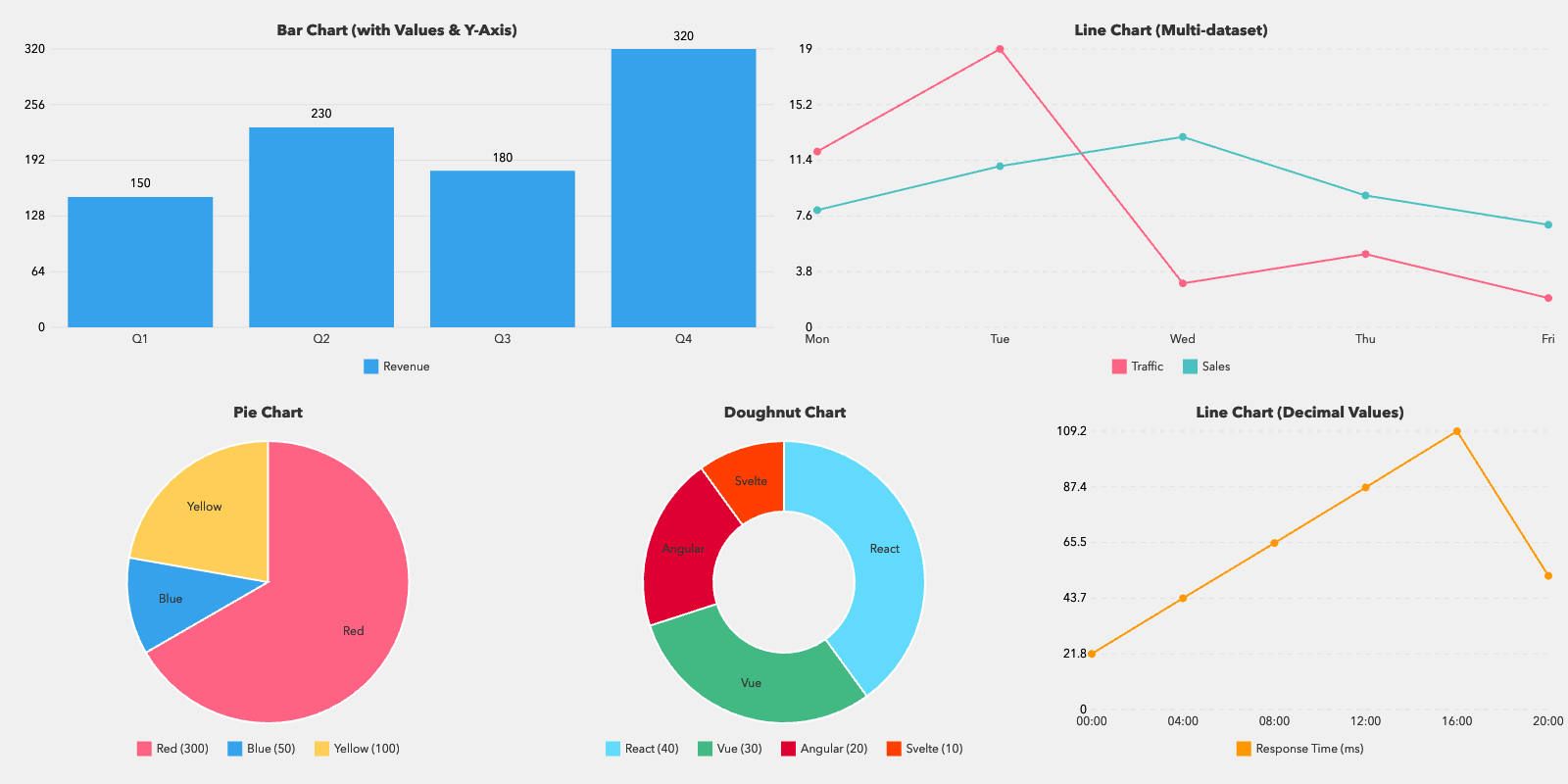
object-fitandobject-positionsupport. Animated sources play at their own rate. - Chart Support: Render bar, line, pie, and doughnut charts with customizable data and options.
- Styling: Style your components with properties that mimic CSS, including borders, padding, margins, and more.
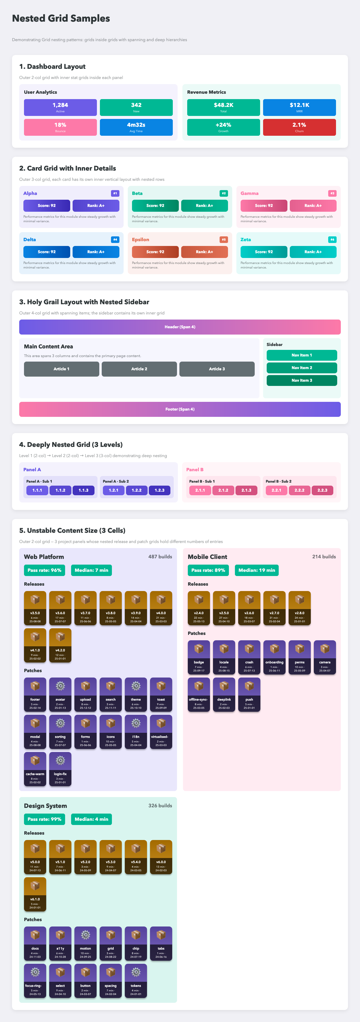
- Grid Layout: A
Gridcomponent is provided for easy grid-based layouts. - Arbitrary Shapes: A
Pathcomponent draws SVG path data — the escape hatch for what the components cannot describe. - Masking: Cut any node to a shape, a path, or a gradient's alpha.

- Animated Output: Render a sequence with one page per frame and export GIF, APNG, animated WebP or AVIF — or PDF and TIFF sheets from the same tree.
- Animation Utilities: Easings, springs solved in closed form, and
track/sequence/parallelfor composing them. Colours interpolate in every format the engine parses. - Engine Control: Choose the GPU or CPU backend, the pixel format and the colour space.
- Dithering:
ditherbreaks up the banding a long, subtle gradient shows on an eight-bit surface. Set it onRootfor the page, or on any node for its own subtree. - Browser-matching text: Line boxes are built the way CSS builds them — baselines land within 0.15px of Chrome —
with
textAlign,verticalAlign,textDecorationandoverflowfollowing the same rules. - TypeScript Support: Fully typed for a better development experience.
- API reference → — generated from the source of each release.
- Architecture →


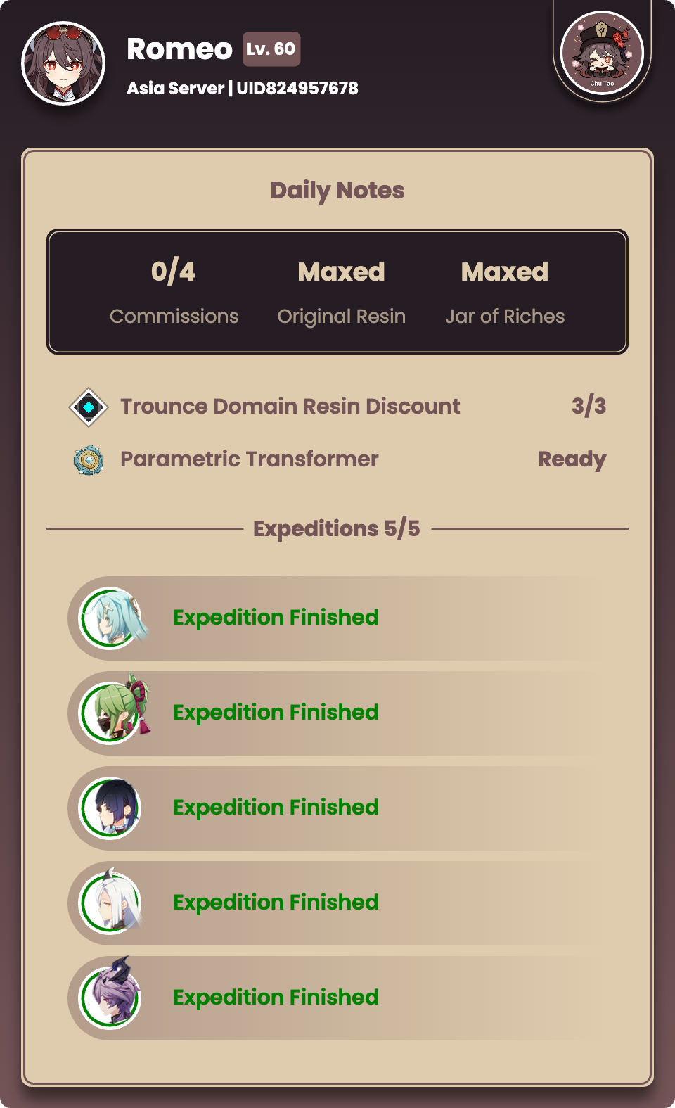
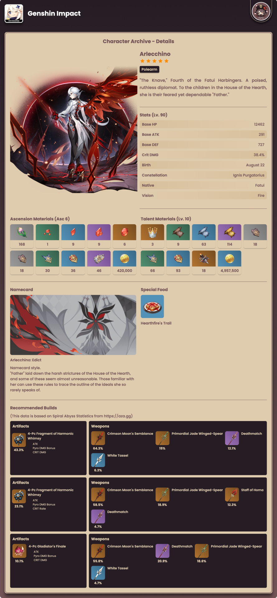
Showcase
 |
 |
 |
 |
 |
 |
 |
|
Installation
bun add meo-canvas
No trustedDependencies entry is needed, on bun or anywhere else. meo-skia-canvas ships its
native binary as one optional dependency per platform, selected by os/cpu/libc, so nothing
has to run an install script for the renderer to work.
Node 22 or newer, and ESM only — import, not require. That is not a preference: the layout
engine, yoga-layout, awaits its WebAssembly module at the top level of its entry, and require()
refuses an ESM graph containing a top-level await on every version of Node. A CommonJS file can
still reach the library through a dynamic import:
// Top-level `await` is not available in CommonJS, so the import is consumed in a callback.
import('meo-canvas').then(({ Root, Box, Text }) => {
// ...
})
Usage
Simple Example
A minimal example that renders a title and description to a PNG file:
import { Root, Box, Text } from 'meo-canvas'
async function generateImage() {
const canvas = await Root({
width: 500,
height: 300,
scale: 1, // increase to 2 for 2× retina resolution
workerMode: true, // renders in a worker thread — keeps the main thread free (default)
fonts: [
{
family: 'Roboto',
paths: ['./fonts/Roboto-Regular.ttf', './fonts/Roboto-Bold.ttf'],
},
],
children: [
Box({
width: '100%',
height: '100%',
backgroundColor: '#f0f0f0',
padding: 20,
children: [
Text('Hello, World!', {
fontSize: 32,
fontWeight: 'bold',
fontFamily: 'Roboto',
color: '#333',
}),
Text('This is a basic example of using meo-canvas.', {
fontSize: 18,
fontFamily: 'Roboto',
color: '#666',
margin: { Top: 10 },
}),
],
}),
],
})
await canvas.toFile('output.png') // saves directly to disk
canvas.release() // free worker memory after use
}
generateImage().catch(console.error)
Complex Layout
A more complete example using Column, Row, Image, and advanced flexbox properties to build a structured page
layout with a header, content area, and footer:
import { Root, Column, Row, Text, Image, Style } from 'meo-canvas'
async function generateComplexImage() {
const canvas = await Root({
width: 800,
height: 600,
scale: 2, // 2× resolution — canvas output will be 1600×1200px
workerMode: true, // renders off the main thread (default)
useDiskCache: true, // caches fetched remote images to disk for faster re-decode
fonts: [
{
family: 'Roboto',
paths: ['./fonts/Roboto-Regular.ttf', './fonts/Roboto-Bold.ttf'],
},
{
family: 'Open Sans',
paths: ['./fonts/OpenSans-Regular.ttf'],
},
],
children: [
Column({
width: '100%',
height: '100%',
backgroundColor: '#f0f0f0',
padding: 20,
justifyContent: Style.Justify.SpaceBetween, // evenly space header, body, footer
children: [
// Header: avatar + title side by side
Row({
width: '100%',
alignItems: Style.Align.Center,
margin: { Bottom: 20 },
children: [
Image({
src: 'https://via.placeholder.com/80x80/FF0000/FFFFFF?text=Logo',
width: 80,
height: 80,
borderRadius: 40, // circle crop
margin: { Right: 20 },
objectFit: 'cover',
}),
Text('Welcome to MeoNode Canvas!', {
fontSize: 40,
fontWeight: 'bold',
fontFamily: 'Roboto',
color: '#333',
}),
],
}),
// Body: grows to fill remaining vertical space
Column({
flexGrow: 1,
width: '100%',
backgroundColor: '#ffffff',
borderRadius: 10,
padding: 30,
boxShadow: { blur: 10, color: 'rgba(0,0,0,0.1)' },
children: [
Text('A New Way to Render Graphics', {
fontSize: 28,
fontWeight: 'bold',
fontFamily: 'Open Sans',
color: '#555',
margin: { Bottom: 15 },
}),
Text(
`This example demonstrates a more complex layout using various components.
We have a header with a logo and title, a main content area with text,
and a footer. Notice how flexbox properties are used to arrange elements.`,
{
fontSize: 18,
fontFamily: 'Open Sans',
color: '#777',
lineHeight: 24,
},
),
Image({
src: 'https://via.placeholder.com/600x200/007bff/ffffff?text=Feature+Image',
width: '100%',
height: 200,
margin: { Top: 20 },
borderRadius: 8,
objectFit: 'contain',
objectPosition: { Top: '50%', Left: '50%' }, // center within box
}),
],
}),
// Footer: centered copyright line
Row({
width: '100%',
margin: { Top: 20 },
justifyContent: Style.Justify.Center,
children: [
Text('© 2025 MeoNode Canvas. All rights reserved.', {
fontSize: 14,
fontFamily: 'Open Sans',
color: '#999',
}),
],
}),
],
}),
],
})
await canvas.toFile('complex_output.png') // saves directly to disk
canvas.release() // free worker memory after use
}
generateComplexImage().catch(console.error)
Examples
Charts
The Chart component supports bar, line, pie, and doughnut chart types.
Bar Chart
import { Root, Chart } from 'meo-canvas'
async function generateBarChart() {
const canvas = await Root({
width: 600,
height: 400,
workerMode: true, // default — render in a worker thread
children: [
Chart({
type: 'bar',
width: '100%',
height: '100%',
data: {
labels: ['Jan', 'Feb', 'Mar', 'Apr', 'May'],
datasets: [
{
label: 'Sales',
data: [120, 150, 180, 90, 200],
color: '#36A2EB',
},
],
},
options: {
grid: { show: true, style: 'dashed' },
axisColor: '#333',
labelColor: '#333',
showValues: true, // display value labels above each bar
valueFontSize: 12,
showYAxis: true, // show Y-axis tick labels on the left
yAxisColor: '#666',
},
}),
],
})
await canvas.toFile('bar_chart.png')
canvas.release()
}
generateBarChart().catch(console.error)
Doughnut Chart with Custom Legend
import { Root, Chart, Row, Box, Text, Style } from 'meo-canvas'
async function generateDoughnutChart() {
const canvas = await Root({
width: 600,
height: 400,
workerMode: true, // default — render in a worker thread
children: [
Chart({
type: 'doughnut',
width: '100%',
height: '100%',
data: [
{ label: 'Red', value: 300, color: '#FF6384' },
{ label: 'Blue', value: 50, color: '#36A2EB' },
{ label: 'Yellow', value: 100, color: '#FFCE56' },
],
options: {
innerRadius: 0.7, // 0 = full pie, 1 = empty ring; 0.7 gives a thick doughnut
sliceBorderRadius: 5, // rounded corners on each slice
// custom legend item: colored dot + "Label: value" text
renderLegendItem: ({ item, color }) =>
Row({
alignItems: Style.Align.Center,
children: [
Box({ width: 12, height: 12, backgroundColor: color, borderRadius: 6 }),
Text(`${item.label}: ${item.value}`, { fontSize: 16, margin: { Left: 8 } }),
],
}),
},
}),
],
})
await canvas.toFile('doughnut_chart.png')
canvas.release()
}
generateDoughnutChart().catch(console.error)
Grid
The Grid component simplifies creating complex layouts. It mimics CSS Grid Layout.
Basic Grid
A simple grid with 3 columns, each 100 pixels wide.
import { Root, Grid, Box, Text } from 'meo-canvas'
async function generateBasicGrid() {
const canvas = await Root({
width: 400,
height: 300,
workerMode: true, // default — render in a worker thread
children: [
Grid({
columns: 3,
templateColumns: [100, 100, 100], // fixed widths; also accepts ['100px', '100px', '100px']
gap: 10,
children: [
Box({ backgroundColor: 'red', height: 50, children: [Text('1')] }),
Box({ backgroundColor: 'blue', height: 50, children: [Text('2')] }),
Box({ backgroundColor: 'green', height: 50, children: [Text('3')] }),
Box({ backgroundColor: 'yellow', height: 50, children: [Text('4')] }), // wraps to row 2
],
}),
],
})
await canvas.toFile('grid_basic.png')
canvas.release()
}
generateBasicGrid().catch(console.error)
Responsive Grid (Fractional Units)
Using fractional units (fr) allows columns to take up proportional space.
Grid({
// First column takes 1 part, second takes 2 parts, third takes 1 part
templateColumns: ['1fr', '2fr', '1fr'],
gap: 10,
children: [
Box({ backgroundColor: 'red', height: 50, children: [Text('1fr')] }),
Box({ backgroundColor: 'blue', height: 50, children: [Text('2fr')] }),
Box({ backgroundColor: 'green', height: 50, children: [Text('1fr')] }),
],
})
Spanning Items
Use GridItem (or pass gridColumn/gridRow props directly to any child) to span multiple columns or rows.
import { Grid, GridItem, Box, Text } from 'meo-canvas'
Grid({
templateColumns: ['1fr', '1fr', '1fr'],
gap: 10,
children: [
// Spans all 3 columns
GridItem({
gridColumn: 'span 3',
height: 50,
backgroundColor: '#333',
children: [Text('Header', { color: 'white' })],
}),
// Standard items
Box({ backgroundColor: '#eee', height: 100, children: [Text('Content')] }),
Box({ backgroundColor: '#ccc', height: 100, children: [Text('Sidebar')] }),
// Spans 2 columns
GridItem({
gridColumn: 'span 2',
height: 50,
backgroundColor: '#555',
children: [Text('Footer', { color: 'white' })],
}),
],
})
Yoga Layout
This library leverages yoga-layout for its powerful flexbox engine. Many layout properties directly map to Yoga's
concepts. You can access Yoga-specific constants through the Style export from meo-canvas.
import { Box, Style } from 'meo-canvas'
Box({
flexDirection: Style.FlexDirection.Row,
justifyContent: Style.Justify.Center,
alignItems: Style.Align.Center,
children: [
Box({
width: 100,
height: 100,
backgroundColor: 'red',
positionType: Style.PositionType.Absolute,
position: { Top: 10, Left: 10 },
}),
// ... other children
],
})
Refer to the Yoga Layout documentation for a comprehensive understanding of these properties.
API Reference
What follows covers the props and methods you reach for most. Every exported symbol carries a doc comment, so the complete generated reference — every type, every option, every overload — lives at l7aromeo.github.io/meo-canvas/latest, and your editor shows the same text on hover.
Each release is published at its own address — /v8.0.0/, /v7.1.0/ and so on — and
the index lists them. latest follows the newest published version, never
whatever is on main, so a link to it always describes something you can actually install.
Root
The Root function is the entry point for rendering. It returns a Canvas object. It is a specialized ColumnNode
that inherits all BoxProps.
Root Props
| Prop | Type | Default | Description |
|---|---|---|---|
width |
number |
- | Required. Width of the canvas in pixels. |
height |
number |
- | Optional height of the canvas. If not set, it's calculated from content. |
children |
CanvasElement | CanvasElement[] | (page: PageInfo) => Children |
- | Required. The component tree to render. Pass a function to render a sequence — one page per call. |
pages |
number |
- | Pages to render. Needs a children function; mutually exclusive with duration. |
duration |
number |
- | Sequence length in seconds; pages become ceil(duration * fps). Needs a children function. |
fps |
number |
30 |
Rate used to derive duration and PageInfo.time. Describes the render, not the encode. |
scale |
number |
1 |
Scale factor for rendering (e.g., 2 for 2x resolution). |
fonts |
FontRegistrationInfo[] |
- | An array of font files to register for use in the canvas. |
useDiskCache |
boolean |
false |
Write fetched images to disk during render for faster re-decode. Entries are cleaned up after render. |
imageConcurrency |
number |
5 |
Maximum number of images to fetch concurrently during render. |
workerMode |
boolean |
true |
Enable worker thread rendering for non-blocking operation. |
workers |
number |
cpus().length - 1 |
Number of worker threads to use (only applies on first render withworkerMode: true). |
Since Root extends BoxProps, it also accepts backgroundColor, padding, gradient, boxShadow, and all other
layout props, dither among them. See Box, Row, and Column for the full list.
Choosing the engine
Three props reach the canvas itself rather than the layout, and the rendered canvas reports what the engine settled on
through gpu, engine, colorType and colorSpace.
| Prop | Type | Default | Description |
|---|---|---|---|
gpu |
boolean |
true |
Rasterize on the GPU when one is available. false forces the CPU. |
colorType |
ColorType |
'rgba' |
Pixel format the canvas composites in — the precision everything is drawn at. |
colorSpace |
ColorSpace |
'srgb' |
Space colours are interpreted in; anything outside its gamut is clipped as it is drawn. |
// Identical output on every machine: GPU and CPU rasterizers resolve anti-aliased edges a level or
// two apart, which a pixel comparison sees.
await Root({ width: 600, gpu: false, children: [...] })
// Sixteen-bit PNG, and colour outside sRGB kept rather than clipped as it is drawn.
await Root({ width: 600, colorType: 'RGBAF32', colorSpace: 'display-p3', children: [...] })
Asking is not getting. These are requests: a build without GPU support, a driver that declines, and any float
colorType all fall back to the CPU. Read the result rather than assuming it:
const canvas = await Root({ width: 600, colorType: 'RGBAF32', gpu: true, children: [...] })
canvas.gpu // false — no GPU composites float
canvas.colorType // 'RGBAF32'
canvas.engine.renderer // 'CPU'
colorType is the one with a cost attached. A float canvas is two to four times the memory, and while translucent
layers are actually faster in float, opaque fills are not — RGBAF32 runs them several times slower. Reach for it
when you need the depth or the gamut, not by default. Masks and shadows composite through offscreen canvases that
inherit these settings, so a float render stays float all the way through.
Smoothing gradients: dither
A long, subtle gradient bands on an eight-bit surface, because there are not enough values between its endpoints to
fill the distance. A ramp from #0b1220 to #1e2b4a across 400px has 42 blue levels to spend, which is a visible step
every 19 pixels. More colour stops cannot help — the values do not exist.
dither spreads each step over neighbouring pixels instead, so the eye averages them back into the tone that was
meant:
// The whole page.
await Root({ width: 800, dither: true, children: [...] })
// Or one subtree, which overrides whatever the page said.
Box({ dither: false, children: [...] })
Unlike gpu, colorType and colorSpace, this is not a property of the canvas: it is inherited down the tree, so a
node takes its nearest ancestor's answer and a node that sets its own leaves its siblings untouched. Masks carry it
onto the offscreen they composite through.
It costs only what it fixes. A flat fill, text and a blurred shadow encode to identical bytes either way — a dither only perturbs a pixel whose colour falls between two the surface can hold. Measured on a 800×400 card with a gradient background, text and shapes:
| Format | Undithered | Dithered |
|---|---|---|
| PNG | 10,672 B | 14,387 B |
| WebP | 7,728 B | 7,808 B |
Lossy encoders absorb the noise almost entirely; PNG pays about a third more across the gradient itself.
A float colorType is the other answer, and the two do not combine — RGBAF16 has the precision to draw the ramp
outright and exports it through a sixteen-bit PNG, with no noise at all. It also forces the CPU backend and costs
several times the memory, and most delivery formats are eight-bit regardless, so dither is the one that applies to
ordinary output.
Multi-page and Animated Output
A page is a frame for gif, apng, webp and avif, a sheet for pdf and tiff, and a size for ico. Pass a function as
children to render a sequence — it runs once per page.
const canvas = await Root({
width: 200,
height: 200,
duration: 1.5, // 36 pages at 24fps
fps: 24,
children: ({ progress }) =>
Box({
width: 40 + progress * 120,
height: 40 + progress * 120,
borderRadius: 999,
borderWidth: 6,
borderColor: `hsl(${Math.round(progress * 320)}, 90%, 60%)`,
}),
})
await canvas.toBuffer('gif', { fps: 24, loop: 0 })
The function receives a PageInfo:
| Field | Type | Description |
|---|---|---|
index |
number |
Zero-based position in the sequence. |
count |
number |
Total pages in this render. |
progress |
number |
0 on the first page, 1 on the last. Use for one-shot interpolation and easing. |
cycle |
number |
0 on the first page, approaching 1 on the last without reaching it. Use for anything that repeats. |
time |
number |
Seconds elapsed, index / fps. Use for physics or spring integration. |
The function may be async, so a page can await its own data. Use pages: n instead of duration when the count
matters more than the timing — a three-page PDF is pages: 3.
Looping: reach for cycle, not progress
progress spans the sequence inclusively, which is what a one-shot animation wants — it should finish on its end value
on the frame the viewer stops on. Anything periodic wants the opposite, because 1 and 0 are the same point on a
circle:
Math.sin(progress * 2 * Math.PI) // the last page repeats page 0 — one frame stands still on every loop
Math.sin(cycle * 2 * Math.PI) // the last page is one step short of the start — the loop closes seamlessly
The stutter is invisible frame by frame and only shows on the wrap, which is what makes it worth knowing about before
you ship it. time shares cycle's half-open span ([0, duration)), so time-driven periodic motion was already
seamless.
Every page must be the same size for gif, apng and tiff, so an animated render needs an explicit height —
without one each page sizes itself to its own content and the encoder rejects the mismatch. pdf is the exception: it
genuinely allows a different size per page, which is why height stays optional.
The animated card in the Showcase is built this way — staggered bars easing to their values, with no
keyframes anywhere. See scripts/generate_sample_animated_card.ts.
Canvas Methods
The Root() function returns a Canvas object with the following methods and properties.
Export Methods
Animation timing — fps, loop, frameDelays — is accepted only by gif, apng, webp and avif. Passing it to any other format
is a compile error, matching the renderer, which raises a TypeError rather than dropping it silently.
page picks one page and pageRange takes a span of them; every format that gathers pages accepts both. See
Exporting part of a sequence.
| Method | Signature | Description |
|---|---|---|
toBuffer |
(format: ExportFormat, options?: ExportOptions) => Promise<Buffer> |
Encodes to the given format. Preferred — see the note below. |
toBufferSync |
(format?: ExportFormat, options?: ExportOptions) => Buffer |
Same, blocking the calling thread until the encode finishes. |
toURL |
(format: ExportFormat, options?: ExportOptions) => Promise<string> |
Returns a data URL. |
toURLSync |
(format?: ExportFormat, options?: ExportOptions) => string |
Blocking data URL. |
toDataURL |
(format?: ExportFormat, quality?: number) => string |
Blocking data URL, with a 0–1 quality shorthand. |
toFile |
(filename: string, options?: SaveOptions) => Promise<void> |
Saves the canvas to a file. |
toFileSync |
(filename: string, options?: SaveOptions) => void |
Blocking file write. |
toSharp |
(options?: RenderOptions) => Sharp |
A Sharp instance for further processing. Requires sharp. |
toSharpSync |
(options?: RenderOptions) => Sharp |
Identical to toSharp(); both build the Sharp on this thread. |
saveAs |
(filename: string, options?: SaveOptions) => Promise<void> |
Deprecated — use toFile(). |
saveAsSync |
(filename: string, options?: SaveOptions) => void |
Deprecated — use toFileSync(). |
toDataURLSync |
(format?: ExportFormat, options?: ExportOptions) => string |
Deprecated — use toDataURL(). |
Supported export formats — every format the renderer encodes, since these types partition its
own ExportFormat rather than restating it:
| Format | Kind | Notes |
|---|---|---|
png |
still | Lossless. 16-bit from a float or 16-bit canvas. |
jpg / jpeg |
still | Lossy; takes quality. Aliases for the same encoder. |
webp |
both | One page is a still, several are an animation. |
gif |
animation | 256 colours; delays round to hundredths of a second. |
apng |
animation | Truecolour with alpha. Each frame carries only the rectangle it changed. |
avif |
animation | Also encodes a single page. Takes bitDepth. |
tiff / tif |
sheets | Gathers every page into one file. Aliases. |
ico |
sizes | Each page is one icon size. |
bmp |
still | Uncompressed. |
pdf |
sheets | The one format whose pages may differ in size. |
svg |
still | Vector. outline: true converts text to paths. |
raw |
still | Pixel data in the canvas's own colorType. |
Prefer the async methods in worker mode. Both produce identical bytes, but
toBuffer()runs the encode off the event loop, whiletoBufferSync()blocks the calling thread for its whole duration — the same way a synchronous method on a plain Canvas does. A sync call also queues behind whatever its worker is currently rendering, because a Canvas is native memory pinned to the thread that drew it.
Repeated sync calls for the same format and options are served from a cache, so asking twice costs one encode.
Convenience Getters
| Getter | Returns | Description | Non-worker |
|---|---|---|---|
.png |
Promise<Buffer> |
Shortcut for toBuffer('png') |
yes |
.jpg |
Promise<Buffer> |
Shortcut for toBuffer('jpg') |
yes |
.webp |
Promise<Buffer> |
Shortcut for toBuffer('webp') |
yes |
.svg |
Promise<Buffer> |
Shortcut for toBuffer('svg') |
yes |
.pdf |
Promise<Buffer> |
Shortcut for toBuffer('pdf') |
yes |
.raw |
Promise<Buffer> |
Shortcut for toBuffer('raw') — raw pixel data |
yes |
.gif |
Promise<Buffer> |
Shortcut for toBuffer('gif') |
— |
.apng |
Promise<Buffer> |
Shortcut for toBuffer('apng') |
— |
.avif |
Promise<Buffer> |
Shortcut for toBuffer('avif') |
— |
.tiff |
Promise<Buffer> |
Shortcut for toBuffer('tiff') |
— |
.ico |
Promise<Buffer> |
Shortcut for toBuffer('ico') |
— |
.bmp |
Promise<Buffer> |
Shortcut for toBuffer('bmp') |
— |
The last six exist only on a worker-mode canvas. A non-worker render hands back the renderer's own
Canvas, which carries the first six and no others — so canvas.gif is a compile error there, and
toBuffer('gif') is the portable spelling. Every format works in both modes; only the shorthand
differs.
Canvas Properties
| Property | Type | Description |
|---|---|---|
.width |
number |
Canvas width in pixels (after scale). |
.height |
number |
Canvas height in pixels (after scale). |
.gpu |
boolean |
Whether the render used the GPU. |
.engine |
EngineDetails |
Renderer, graphics API, device and thread count. |
Not available in worker mode
getContext(), newPage() and pages each hand back a live rendering context bound to native
memory inside the worker, which cannot cross a thread boundary — proxying one would mean a round
trip per drawing call. They throw in worker mode. Use Root({ workerMode: false }) if you need to
drive a context directly; drawing is otherwise expressed as a component tree.
Memory Management (Worker Mode)
| Method | Description |
|---|---|
.release() |
Required in worker mode. Releases the Canvas from worker memory. Call when done to prevent memory leaks. |
import {Root} from 'meo-canvas'
// Render with default worker mode (enabled)
const canvas = await Root({width: 400, height: 400, children: [...]})
// Or explicitly disable worker mode
const canvas = await Root({width: 400, height: 400, children: [...], workerMode: false})
// Use the canvas
const png = await canvas.png
const jpg = await canvas.jpg
await canvas.toFile('output.png')
// Release memory (worker mode only)
canvas.release()
Release in a finally if anything between render and export can throw, or the canvas is stranded on
the error path:
const canvas = await Root({width: 400, height: 400, children: [...]})
try {
return await canvas.toBuffer('webp')
} finally {
canvas.release()
}
Note: A
FinalizationRegistryis wired up as a backstop, but do not rely on it. The memory it guards is native, so it creates no pressure on the garbage collector and the callback may never fire: 400 renders without an explicit release grew RSS from 247 MB to 677 MB with no plateau, even forcing a collection every round. The same 400 renders releasing explicitly settle flat.
Animation Utilities
Everything below is a pure function of the page, so it can be called for any page in any order and never carries state between them.
Tracks
A track declares one animation and is sampled per page. It works in seconds, which is what
duration and fps already speak.
import { Root, Box, track } from 'meo-canvas'
const grow = track({ from: 0, to: 1, duration: 0.75, delay: 0.1, stagger: 0.18, ease: 'outCubic' })
const canvas = await Root({
width: 640,
height: 320,
duration: grow.totalDuration(3), // long enough for all three staggered items
fps: 24,
children: page => Box({ children: SERIES.map((s, i) => Bar({ fill: grow.at(page, i) })) }),
})
| Option | Type | Description |
|---|---|---|
from |
number | string | array |
Value before the track starts. Strings are colours. |
to |
number | string | array |
Value once it has finished. |
duration |
number |
Seconds the motion lasts. Required unless spring supplies one. |
delay |
number |
Seconds to wait before starting. |
stagger |
number |
Extra delay per item index, for offsetting a row of elements. |
ease |
EasingName | function |
Easing curve. Mutually exclusive with spring. |
spring |
SpringConfig |
Spring physics instead of an easing; supplies its own duration. |
track.at(page, index?) reads the value, track.duration is when the first item finishes, and
track.totalDuration(count) is when the last staggered one does.
Sequences
A track moves between two values. When a value has to move, wait, then move again, sequence
chains the legs — each starting where the previous finished — and returns the same shape a track
does, so the two are interchangeable at the call site.
import { sequence } from 'meo-canvas'
const badge = sequence({
from: -40,
steps: [
{ to: 0, spring: { stiffness: 200, damping: 14 } }, // drop in
{ to: 0, duration: 0.6, hold: 0.6 }, // rest there
{ to: -40, duration: 0.3, ease: 'inCubic' }, // leave
],
delay: 0.2,
stagger: 0.1,
})
badge.at(page) // or badge.at(page, index) when staggered
| Step option | Type | Description |
|---|---|---|
to |
number | string | array |
Value at the end of this leg. |
duration |
number |
Seconds this leg lasts. Required unless spring supplies one. |
ease |
EasingName | function |
Easing for this leg. Mutually exclusive with spring. |
spring |
SpringConfig |
Spring physics for this leg; supplies its own duration. |
hold |
number |
Seconds to rest at to before the next leg begins. |
A trailing hold is not counted in duration, since nothing moves during it — a render sized from
sequence.duration would otherwise end on dead frames.
Groups
parallel runs several of them at once: one sample per page, and one duration covering whichever
member finishes last.
import { parallel, track } from 'meo-canvas'
const ring = parallel({
tint: track({ from: '#38bdf8', to: '#f472b6', duration: 1.4, ease: 'inOutSine' }),
scale: track({ from: 0.6, to: 1, spring: { stiffness: 190, damping: 12 } }),
})
const canvas = await Root({
width: 200,
height: 200,
duration: ring.duration, // the longest member, whichever that is
fps: 24,
children: page => {
const { tint, scale } = ring.at(page)
return Box({ borderColor: tint, transform: { scale } })
},
})
Groups take tracks, sequences and other groups, since all three are sampled the same way. The
duration is the point: writing Math.max(a.duration, b.duration, …) by hand has to be corrected
every time a track is added, and forgetting one leaves the render ending before its own animation
does — silently, mid-fade.
Easing
easings carries the standard catalogue — linear, plus in/out/inOut of Quad, Cubic,
Quart, Quint, Sine, Expo, Circ, Back, Elastic and Bounce. Every curve is pinned to 0
at the start and 1 at the end, and clamps outside that range. cubicBezier(x1, y1, x2, y2) builds a
CSS-compatible curve, and steps(n) quantises.
Anywhere an easing is accepted, it can be a name or a function — resolveEasing(easing) is what
turns one into the other, and it is exported for building your own utilities on the same footing.
An absent easing resolves to linear.
Springs
Springs are solved in closed form, not simulated, so any page can be evaluated on its own:
import { spring, springDuration, track } from 'meo-canvas';
const config = { stiffness: 190, damping: 12 };
// A spring settles asymptotically, so let the physics size the render.
const canvas = await Root({ duration: springDuration(config), fps: 30, children: page => ... });
const scale = track({ from: 0.6, to: 1, spring: config });
| Option | Default | Description |
|---|---|---|
stiffness |
170 |
How hard it pulls toward the target. |
damping |
26 |
Resistance. Past critical it stops overshooting — and settles slower. |
mass |
1 |
Inertia. |
velocity |
0 |
Speed at t = 0, in units per second. |
Interpolation and colour
lerp(0, 100, 0.25) // 25 — unclamped, so overshooting easings still overshoot
mapRange(50, [0, 100], [0, 1], { clamp: true }) // 0.5
interpolate(0.25, [0, 0.5, 1], [0, 100, 0]) // 50 — keyframes, holding at both ends
mix('#000000', '#ffffff', 0.5) // '#808080'
mix blends numbers, arrays and colours. Colour parsing is delegated to the rendering engine rather
than reimplemented, so every format the engine accepts works — named colours, #rgb/#rgba/
#rrggbb/#rrggbbaa, rgb()/rgba() in both legacy and modern syntax, hsl(), hwb(), lab(),
lch(), oklab(), oklch() and color(display-p3 …). Anything the engine learns later works too.
An unrecognised colour throws rather than rendering as a silent black.
Colours outside sRGB survive rather than being clipped. color(display-p3 1 0 0) is a redder red
than sRGB can express, and it is carried as extended sRGB — channels above 255 or below 0 that name
the same colour in sRGB's coordinates — so blending two wide-gamut colours does not quietly collapse
them into duller ones. formatColor writes an ordinary colour as hex, or rgba() once alpha is
involved, and switches to color(srgb …) only when a channel falls outside what hex can hold.
parseColor('color(display-p3 1 0 0)') // { r: 278.73, g: -57.81, b: -38.28, a: 1 }
mix('color(display-p3 1 0 0)', 'color(display-p3 0 1 0)', 0.5) // 'color(srgb 0.290625 0.395799 -0.230419)'
mix('#000000', '#ffffff', 0.5) // '#808080' — in gamut, so still hex
Alpha is a separate matter: the engine serialises it as one of 256 levels, so rgba(9, 9, 9, 0.12345)
resolves to 0.122. That is the renderer's precision, not something this layer adds or removes.
Two more are exported for when you want them directly. mixColor(from, to, t) is what mix calls
for colours, usable on its own when you know both ends are colours. isColor(css) answers whether
the engine recognises a string, and never throws — the way to check before handing user input to a
prop that would otherwise reject it.
mixColor('#000000', '#ffffff', 0.5) // '#808080'
isColor('rebeccapurple') // true
isColor('not a colour') // false
fps on Root sizes the sequence and derives time; it does not reach the encoder. Pass it again to toBuffer if
the encoded animation should play at that rate, or give frameDelays one entry per page for uneven timing. GIF stores
hundredths of a second, so 24fps alternates 40ms and 50ms frames; APNG stores a fraction and hits the rate exactly.
loop controls how many times it plays: 0 — the default — repeats forever, 1 plays it once, and any other number
plays it that many times.
await canvas.toBuffer('gif', { fps: 24, loop: 0 }) // forever
await canvas.toBuffer('gif', { fps: 24, loop: 1 }) // once
await canvas.toBuffer('apng', { fps: 24, loop: 3 }) // three times
The two formats disagree about how to say this, and the encoder reconciles it: GIF counts the repeats that follow the
first play, so three plays is stored as 2, and because 0 there already means "forever" a single play can only be
expressed by leaving the block out entirely. APNG stores the play count directly.
Exporting part of a sequence
pageRange takes a span of pages instead of all of them — numbered from 1, inclusive at both ends, with negative
numbers counting from the end.
await canvas.toBuffer('webp', { fps: 30, pageRange: [1, 20] }) // the first twenty pages
await canvas.toBuffer('webp', { fps: 30, pageRange: [21, -1] }) // everything from the twenty-first on
await canvas.toBuffer('pdf', { pageRange: [12, 18] }) // one chapter of a long document
The case it exists for is an intro that plays once followed by a loop that repeats forever. A single file cannot say that — it carries one loop count — so it is two exports of the same canvas:
const canvas = await Root({ width: 600, height: 300, pages: 60, fps: 30, children: page => card(page) })
const intro = await canvas.toBuffer('webp', { fps: 30, pageRange: [1, 20], loop: 1 })
const loop = await canvas.toBuffer('webp', { fps: 30, pageRange: [21, 60], loop: 0 })
Worth knowing before you build around it: whatever must survive looping has to be at its final value on the loop segment's first page. No animated format has a loop-start marker, so a repeat restarts at that frame — anything still mid-transition there flickers on every pass.
A bound the canvas does not have is a RangeError rather than a clamped range. The renderer validates before it
encodes, so a non-worker canvas throws on the call itself while worker mode delivers the same error as a rejection —
await inside a try catches both.
Box, Row, and Column
These are the fundamental layout components. Row and Column are wrappers around Box with a pre-set
flexDirection. They all share the same props.
Layout Props
| Prop | Type | Description |
|---|---|---|
width, height |
number | string |
Sets the size of the node in pixels or percentage. |
minWidth, minHeight |
number | string |
Sets the minimum size of the node. |
maxWidth, maxHeight |
number | string |
Sets the maximum size of the node. |
flexDirection |
Style.FlexDirection |
Defines the direction of the main axis (Row, Column, etc.). |
justifyContent |
Style.Justify |
Defines how items are distributed along the main axis. |
alignItems |
Style.Align |
Defines how items are aligned along the cross axis. |
alignSelf |
Style.Align |
Overrides the parent'salignItems for a specific item. |
alignContent |
Style.Align |
Defines how lines are distributed when content wraps. |
flexGrow |
number |
Defines the ability of an item to grow. |
flexShrink |
number |
Defines the ability of an item to shrink. |
flexBasis |
number | 'auto' | string |
Defines the default size of an item along the main axis. |
flexWrap |
Style.Wrap |
Controls whether flex items wrap to multiple lines. |
positionType |
Style.PositionType |
Sets the positioning method (Relative or Absolute). |
position |
object | number | string |
Sets the offset for a positioned element. |
margin |
object | number | string |
Sets the margin space on the outside of the node. |
padding |
object | number | string |
Sets the padding space on the inside of the node. |
border |
object | number |
Sets the width of the node's border. |
aspectRatio |
number |
Locks the aspect ratio (width / height) of the node. |
overflow |
Style.Overflow |
Defines how content that overflows is handled (Visible, Hidden). |
display |
Style.Display |
Controls if the node is included in layout (Flex, None). |
direction |
Style.Direction |
Sets the primary layout direction (LTR, RTL). |
gap |
object | number | string |
Defines the space between flex items. |
boxSizing |
Style.BoxSizing |
Defines howwidth and height are interpreted (ContentBox, BorderBox). |
zIndex |
number |
Stack order among absolutely positioned siblings; unset paints above in-flow content, negative below. |
children |
CanvasElement | CanvasElement[] |
Child nodes to render inside this node. |
Styling Props
| Prop | Type | Description |
|---|---|---|
backgroundColor |
string |
Sets the background color of the node. |
backgroundImage |
{ src, repeat?, size?, position? } |
A picture behind the node's content, tiled as CSS background-repeat does — space and round included. |
borderColor |
string | EdgeColors |
Colour of the node's border — one string for all four edges, or a colour per edge. Unset edges fall back to black. |
borderStyle |
Style.Border |
Sets the style of the border (Solid, Dashed, Dotted). |
borderRadius |
CornerRadii | number |
Radius of the node's corners — one number for all four, or a radius per corner. |
opacity |
number |
Sets the opacity of the node and its children (0-1). |
filter |
string |
CSS filter chain applied to the node and its children as one picture — blur(4px) grayscale(1). |
backdropFilter |
string |
CSS backdrop-filter — filters what is behind the node, clipped to its box; the node's own background paints over it. |
mixBlendMode |
Style.BlendMode |
How the node and its children combine with what is painted behind — Multiply, Screen, Overlay and the rest of CSS's sixteen. |
gradient |
object |
A linear, radial or conic gradient as the background. A conic sweep starts at twelve o'clock, with from and at. |
dither |
boolean |
Breaks up gradient banding — see Smoothing gradients. Inherited by descendants. |
mask |
Mask |
Limits what of the node is drawn — see below. |
boxShadow |
BoxShadowProps | BoxShadowProps[] |
Applies one or more box-shadow effects. |
transform |
TransformProps |
Applies 2D transformations (translate, rotate, scale). |
Shadows
boxShadow takes one shadow or an array of them, drawn in the order given. The fields are the CSS
box-shadow lengths under their own names:
Box({ boxShadow: { offsetX: 0, offsetY: 4, blur: 12, color: 'rgba(0,0,0,0.2)' } })
// A ring, which is what spread is for
Box({ boxShadow: { offsetX: 0, offsetY: 0, blur: 0, spread: 3, color: '#2563eb' } })
// Inset: the shadow falls inward from the edges the offset comes from
Box({ boxShadow: { inset: true, offsetX: 0, offsetY: 2, blur: 6, color: 'rgba(0,0,0,0.35)' } })
spread grows the shape before it is blurred, so a spread shadow is a larger copy rather than a
wider blur; a square corner stays square however far it spreads, as the spec requires. blur is the
CSS radius, not a standard deviation — the shadow is at half strength on the silhouette's edge and
fades out over roughly that distance beyond it.
An outer shadow is never painted underneath its own box, which only shows when the background lets something through: a node with no background, or a translucent one, does not darken itself.
Masking
mask limits what of a node reaches the canvas — its background, border, content and children alike, the way CSS
mask does. Every component takes it, Text, Image, Chart and Grid included.
// A shape inscribed in the node's box
Image({ src: avatar, width: 96, height: 96, mask: { shape: 'circle' } })
// SVG path data, in the node's own coordinates — 0,0 is its top-left corner
Box({ width: 100, height: 100, mask: 'M 50 0 L 100 100 L 0 100 Z' })
// A hole, via the even-odd rule
Box({ mask: { path: 'M 0 0 H 200 V 80 H 0 Z M 20 20 H 80 V 60 H 20 Z', fillRule: 'evenodd' } })
// A soft fade: only the alpha of each colour matters
Box({ mask: { gradient: { type: 'linear', direction: 'to-bottom', colors: ['#000', 'transparent'] } } })
| Form | Meaning |
|---|---|
'M 0 0 …' |
SVG path data. Shorthand for { path }. |
{ shape } |
'circle' (sized by the shorter side) or 'ellipse' (fills the box). |
{ path, fillRule } |
'nonzero' by default; 'evenodd' makes nested subpaths cut holes. |
{ gradient } |
The same shape as the gradient prop. Opaque keeps a pixel, transparent removes it. |
The two kinds cost differently. A shape or path clips — a yes-or-no test per pixel, cheap enough to put on every node in a list. A gradient composites: the node is drawn into an offscreen canvas of its own box and multiplied by the gradient's alpha, which is what buys the values in between. Reach for a shape unless you want a soft edge.
Two limits worth knowing before you design around them:
- The mask applies to the node's layout box, before its own
transform. Content a transform pushes outside that box is not masked back in. - A gradient that cannot be built — no colours, an unknown direction — drops the mask, not the node, and warns. Losing what was drawn would be a worse answer than losing how it was cut.
Font & Text Props (Inheritable)
These props, when set on a Box, Row, or Column, are inherited by any descendant Text nodes.
| Prop | Type | Description |
|---|---|---|
fontSize |
number |
Font size in pixels. |
fontFamily |
string |
Font family name. |
fontWeight |
string | number |
Font weight ('normal', 'bold', 400, etc.). |
fontStyle |
'normal' | 'italic' |
Font style. |
color |
string |
Text color. |
textAlign |
'start' | 'end' | 'left' | 'center' | 'right' | 'justify' |
Horizontal text alignment. |
verticalAlign |
'top' | 'middle' | 'bottom' |
Vertical text alignment. |
lineHeight |
number |
Line box height in pixels. Defaults to the face's own height, as line-height: normal does. |
lineGap |
number |
Additional vertical spacing between lines. |
letterSpacing |
number | string |
Spacing between letters. |
wordSpacing |
number | string |
Spacing between words. |
fontVariant |
FontVariantSetting |
Specifies font variation settings. |
textDecoration |
string |
Lines on the text, in CSS text-decoration notation. Inherited. |
textStroke |
{ width, color } |
An outline on the glyphs, as CSS -webkit-text-stroke — centred, and over the fill unless paintOrder says otherwise. |
paintOrder |
Style.PaintOrder |
Whether the stroke is painted over the fill (CSS's default) or under it, keeping the letterform whole. |
How text is positioned
Text is laid out the way CSS lays out a line box, so a design ported from the browser lands in the
same place. Measured against Chrome with the same Roboto file, a 260x100 box and 32px/38.4px, the
baseline agrees to 0.15px across top, middle, bottom, an explicit lineHeight, the
default one, and the second line of a two-line block.
Two consequences worth knowing:
- A line does not move because of what is written on it. The line box comes from the font's own
ascent and descent, not from the ink of the glyphs, so
applyandacornsit on exactly the same baseline. A descender never pushes a centred line upward. lineHeightis taken literally. Set it smaller than the face needs and the lines overlap, exactly as CSS does — the line box is not quietly grown to fit. Leave it unset and it is the face's ascent plus descent.
lineGap is extra space between lines on top of all that, with no CSS equivalent.
Absolute positioning resolves against the immediate parent. CSS resolves it against the nearest positioned ancestor, skipping static boxes in between; Yoga always uses the parent. A layout ported from the browser that relies on that skipping will land somewhere else — put the offsets on the node's own parent instead.
Bidirectional text is not laid out. direction is Yoga's layout direction — it flips the flex
axes — and does not reorder text. A right-to-left script renders in the order its characters were
written rather than reordered by the Unicode bidi algorithm, so Arabic and Hebrew are not supported.
Overflow follows CSS too. Text taller or wider than its box spills out of it; set
overflow: Style.Overflow.Hidden on the node to clip it. Style.Overflow.Scroll is not treated as
clipping — it describes a box a reader can move, and nothing here is interactive.
Underlines and strikethroughs
textDecoration takes the notation CSS text-decoration uses. A line keyword on its own is the
common case; a style, a colour and a thickness may follow in any order, and two line keywords may be
combined. Anything that does not parse draws nothing rather than throwing.
Text('Sold out', { textDecoration: 'line-through' })
Text('Heading', { textDecoration: 'underline 3px #2563eb' })
Text('Misspelt', { textDecoration: 'underline wavy #dc2626' })
Text('Both', { textDecoration: 'underline line-through' })
It is inherited, so decorating a Box decorates the text inside it.
One limit worth knowing: a line is drawn in a single call so its rule is unbroken across the spaces,
which is only possible while the whole line is one style. A line carrying rich-text markup --
<b>, <color>, <size> -- is drawn a word at a time, and its rule breaks at each space.
Text
The Text component renders text content. It inherits all BoxProps except for children, gap, and flex container
properties.
Text-Specific Props
| Prop | Type | Description |
|---|---|---|
maxLines |
number |
Maximum number of lines to display before truncating. |
ellipsis |
boolean | string |
Iftrue, adds '...' when text is truncated. Can also be a custom string. |
textShadow |
TextShadowProps | TextShadowProps[] |
Applies one or more shadow effects to the text itself. |
Image
The Image component renders an image. It inherits all BoxProps except for children.
Image-Specific Props
| Prop | Type | Description |
|---|---|---|
src |
string | Buffer |
The source URL, file path, or buffer of the image. |
httpOptions |
RequestInit |
Fetch options (headers, method, body, etc.) applied when src is a remote http/https URL. Ignored for file paths and buffers. Folded into the cache key. |
objectFit |
'fill' | 'contain' | 'cover' | 'none' | 'scale-down' |
Specifies how the image should be resized to fit its container. |
frame |
number |
Frame to draw from an animated source instead of playing it. Negative counts from the end. |
loop |
boolean |
Whether an animated source restarts after its last frame. Default true. |
objectPosition |
object |
Specifies the alignment of the image within its box. |
saturate |
number |
Adjusts the image's saturation level (0 is grayscale, 1 is original). |
dropShadow |
DropShadowProps |
Applies a drop-shadow effect based on the image's alpha channel. |
alt |
string |
Alternative text description (for accessibility). |
onLoad |
() => void |
Callback function that executes when the image loads successfully. |
onError |
(error: Error) => void |
Callback function that executes when the image fails to load. |
Animated Image Sources
An animated gif, apng, webp or avif plays by itself in a paged render, advancing at the
source's own rate — a 10fps GIF in a 24fps render changes on the pages it should, not once per page.
// Plays. Nothing to compute.
children: () => Image({ src: 'spinner.gif', width: 64, height: 64 })
| Prop | Type | Description |
|---|---|---|
frame |
number |
Pin one frame instead of playing. Negative counts from the end; an absent frame throws. |
loop |
boolean |
false holds the last frame rather than restarting. Default true. |
A still render draws the first frame, as it always has. Decoding happens once per source however many pages read it, so a long animation costs one decode rather than one per frame.
Path
Draws an arbitrary shape from SVG path data — the escape hatch for what the other components cannot describe: an arrow, a tick, a connector, a badge with a notch.
Path({ d: 'M 0 0 L 100 0 L 50 80 Z', fill: '#38bdf8', width: 100, height: 80 })
Path({ d: 'M 0 20 H 80', stroke: '#f43f5e', lineWidth: 4, lineCap: 'round', width: 80, height: 40 })
| Prop | Type | Description |
|---|---|---|
d |
string |
Required. SVG path data, in the node's own coordinates. |
fill |
string | Gradient |
Paint for the interior. Nothing is filled without it. |
stroke |
string | Gradient |
Paint for the outline. Nothing is stroked without it. |
lineWidth |
number |
Stroke width. Default 1. |
fillRule |
'nonzero' | 'evenodd' |
evenodd makes nested subpaths cut holes. Default nonzero. |
lineCap |
'butt' | 'round' | 'square' |
Shape of a stroke's ends. Default butt. |
lineJoin |
'bevel' | 'round' | 'miter' |
Shape of a stroke's corners. Default miter. |
lineDash |
number[] |
Dash and gap lengths, as [dash, gap, …]. |
lineDashOffset |
number |
Where the dash pattern starts — animate it for marching ants. |
It also takes every BoxProps, so it is laid out by flexbox and can carry a background, border, mask, opacity or
transform like anything else.
Two things worth knowing. Coordinates are the node's own — 0,0 is its top-left corner, as with mask — so the
same path means the same shape wherever layout puts it. And the path does not size the node: give it a width and
height, because layout is decided before the path is drawn and a path can extend anywhere.
fill and stroke accept the same gradient shape the gradient prop takes, measured against the node's box rather
than the path, so two shapes in one box share a ramp instead of each restarting it.
This is deliberately declarative rather than a drawing context. A CanvasRenderingContext2D is native memory pinned to
the thread that made it, so it cannot cross into a worker — Path is plain data and survives the trip. If you genuinely
need the raw context, render with workerMode: false and take it from the finished canvas:
const canvas = await Root({ workerMode: false, width: 600, children: [...] })
const ctx = canvas.getContext('2d')
ctx.filter = 'blur(2px)'
ctx.drawImage(watermark, 20, 20)
await canvas.toFile('out.png')
Grid
The Grid component arranges its children in a grid layout. It is a specialized RowNode and inherits most BoxProps.
Grid-Specific Props
| Prop | Type | Description |
|---|---|---|
columns |
number |
The number of columns in the grid. Default is 1. |
templateColumns |
GridTrackSize[] |
Defines the columns of the grid (e.g.,[100, '1fr']). |
templateRows |
GridTrackSize[] |
Defines the rows of the grid. |
autoRows |
GridTrackSize |
Specifies the size of implicitly created rows. |
autoFlow |
'row' | 'column' | 'row-dense' | 'column-dense' |
Controls how the auto-placement algorithm works. Default is 'row'. |
Gap control:
gapis inherited fromBoxProps. Pass a number for uniform spacing, or an object for per-axis control:gap: { Row: 10, Column: 20 }.
GridItem
The GridItem component represents a child item within a Grid. It inherits all BoxProps and adds grid placement
properties.
GridItem-Specific Props
| Prop | Type | Description |
|---|---|---|
gridColumn |
string |
Specifies the column span (e.g.,'span 2', '1 / 3'). |
gridRow |
string |
Specifies the row span (e.g.,'span 2', '1 / 3'). |
gridArea |
string |
Shorthand forgridRow and gridColumn (e.g., 'header'). |
Note: You can also use
gridColumnandgridRowprops directly on any child component (Box,Text, etc.) without wrapping inGridItem.
Chart
The Chart component renders various types of charts. It inherits all BoxProps.
Chart-Specific Props
| Prop | Type | Description |
|---|---|---|
type |
'bar' | 'line' | 'pie' | 'doughnut' |
The type of chart to render. |
data |
CartesianChartData | PieChartDataPoint[] |
The data for the chart, which varies based on thetype. |
options |
ChartOptions<T> |
An object containing rendering and style options, specific to the chart type. |
ChartOptions
The options prop is a conditional type that changes based on the chart type.
Common Options (All Chart Types)
| Prop | Type | Description |
|---|---|---|
showLabels |
boolean |
Iftrue, displays labels on the chart. |
showLegend |
boolean |
Iftrue, displays the chart legend. |
labelFontSize |
number |
Font size for labels and legend text. |
labelColor |
string |
Color for labels and legend text. |
legendPosition |
'top' | 'bottom' | 'left' | 'right' |
The position of the legend relative to the chart. |
renderLabelItem |
(props: { item, index }) => BoxNode |
A custom render function for chart labels. |
renderLegendItem |
(props: { item, index, color }) => BoxNode |
A custom render function for legend items. |
Cartesian Chart Options (bar, line)
| Prop | Type | Description |
|---|---|---|
grid |
GridOptions |
Configures grid lines (show, color, style: 'solid' | 'dashed' | 'dotted'). |
axisColor |
string |
The color of the chart axes. |
showValues |
boolean |
If true, displays values on top of bars or points. |
valueColor |
string |
Color of the value labels. |
valueFontSize |
number |
Font size of the value labels. |
renderValueItem |
(props: { item: number; index: number; datasetIndex: number }) => BoxNode |
Custom render function for each value label above a bar or point. |
showYAxis |
boolean |
If true, displays the Y-axis labels on the left. |
yAxisColor |
string |
Color of the Y-axis labels. |
yAxisFontSize |
number |
Font size of the Y-axis labels. |
yAxisLabelFormatter |
(value: number) => string |
Custom formatter for Y-axis labels. Smart defaults adjust decimal precision based on value range. |
xAxisLabelFormatter |
(value: string, index: number) => string |
Custom formatter for X-axis labels. Useful for truncating or transforming labels. |
Y-Axis Label Formatter
The yAxisLabelFormatter enables custom Y-axis label formatting. By default, it uses smart formatting:
- Values < 1: 4 decimals (e.g.,
0.0025) - Values 1-100: 2 decimals (e.g.,
25.43) - Values 100-1000: 1 decimal (e.g.,
250.5) - Values 1000-1M: 0 decimals (e.g.,
50000) - Values ≥ 1M: 1 decimal with "M" suffix (e.g.,
1.5M)
Custom example:
options: {
yAxisLabelFormatter: (value) => `$${value.toFixed(2)}`,
}
X-Axis Label Formatter
The xAxisLabelFormatter allows custom X-axis label transformations. It receives the label string and its index.
Custom example:
options: {
xAxisLabelFormatter: (label, index) =>
label.length > 5 ? label.substring(0, 5) + '...' : label,
}
Pie & Doughnut Chart Options (pie, doughnut)
| Prop | Type | Description |
|---|---|---|
innerRadius |
number |
The radius of the inner circle in a doughnut chart (0 to 1). Default is 0.6. |
sliceBorderRadius |
number |
The border radius for the corners of each slice. Default is 0. |
Cleanup Functions
terminate()
Terminate all worker pools and free worker thread resources. Call this when shutting down a long-running server.
import { terminate } from 'meo-canvas'
// Call on server shutdown
process.on('SIGTERM', () => {
terminate()
process.exit(0)
})
After calling
terminate(), the worker pool will be lazily re-initialized on the nextRoot()call.
clearDiskCache()
Manually clear the entire disk cache directory. Useful for debugging or forced cleanup.
import { clearDiskCache } from 'meo-canvas'
await clearDiskCache()
Note: Disk cache is automatically cleaned up after each render when
useDiskCache: true, and on process exit.
setDiskCacheDir(dir)
Override the default disk cache directory. Must be called before any cache read/write operations.
import { setDiskCacheDir } from 'meo-canvas'
setDiskCacheDir('/tmp/my-custom-cache')
Contributing
Contributions are welcome! Please see the Contributing Guidelines for more details on how to get started.
License
This project is licensed under the MIT License - see the LICENSE file for details.